
10 Modern Exterior Colors for 2025
Make an appointment
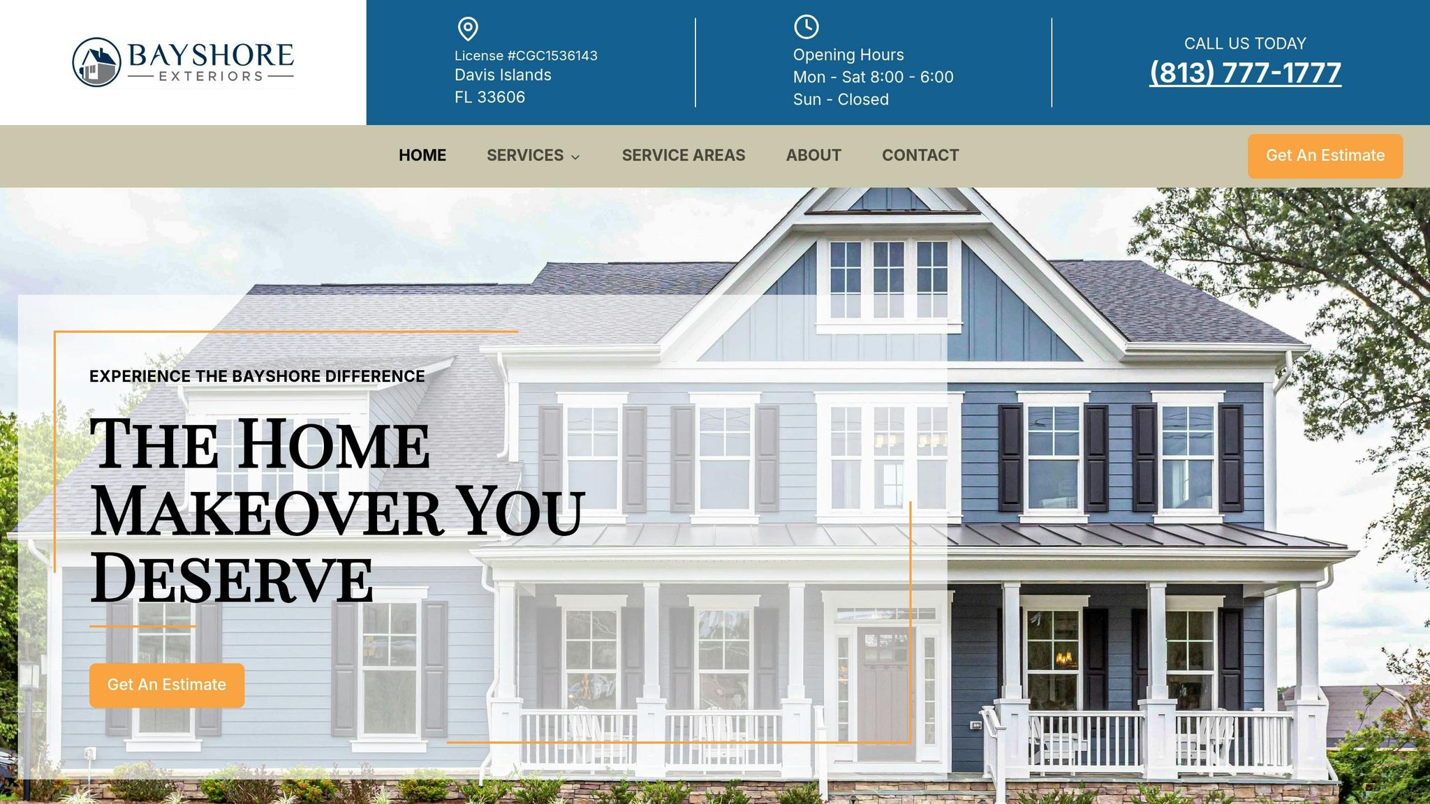
Get a Free Estimate Today
10 Modern Exterior Colors for 2025
Looking to refresh your home's exterior? Here are 10 trending colors for 2025 that balance style and practicality. These shades range from bold and rich tones to nature-inspired neutrals, offering options for every home style. Here's a quick overview:
- Charcoal Gray: Bold and timeless, pairs well with white trim and natural wood.
- Sage Green: Soft and earthy, complements stone and dark bronze accents.
- Warm Terracotta: Earthy orange-red, ideal for Spanish Revival or Southwest styles.
- Navy Blue: Deep and classic, works with brass or copper finishes.
- Crisp White: Clean and bright, enhances natural light and curb appeal.
- Soft Taupe: Warm and versatile, blends gray and brown tones.
- Slate Blue: Sophisticated gray-blue, great for modern or coastal homes.
- Muted Olive: Understated green, perfect for blending with landscaping.
- Warm Greige: A mix of gray and beige, adaptable for many designs.
- Deep Teal: Bold blue-green, adds a modern yet natural touch.
These colors are designed to highlight architectural details, blend with surroundings, and require minimal upkeep. For the best results, choose high-quality, UV-resistant paints and pair them thoughtfully with trims, accents, and materials.
10 Best Exterior House Paint Colors for 2025 [Trends & Timeless]
1. Charcoal Gray
Charcoal gray brings bold style with a timeless edge, making it a standout choice for modern exteriors in 2025. Its rich depth enhances architectural details like trim and windows. When paired with white or light gray accents and finished with brushed nickel or matte black fixtures, it creates a sleek, contemporary vibe.
One practical bonus? Its darker tone hides dirt well, so you won’t need to clean as often while still keeping your home looking sharp.
Here are some pairing ideas:
- Natural wood accents like cedar or teak for added warmth
- Crisp white trim to create a striking contrast
- Black window frames to emphasize a modern aesthetic
Charcoal gray works beautifully with materials like fiber cement siding and architectural panels. Its neutral base also makes it easy to update with seasonal decor. Keep in mind, though, that sunlight can subtly change its appearance - walls facing south might look slightly lighter than those facing north, giving your exterior a natural variation in tone.
To keep the charcoal shade looking fresh, choose a high-quality exterior paint with UV protection. Ready to explore more trending colors? Let’s keep going!
2. Sage Green
Sage green is making waves in 2025, blending nature-inspired tones with a modern aesthetic. This soft, earthy green creates a calming atmosphere and works well with a variety of architectural styles.
Its flexibility lies in how easily it pairs with both light and dark accents. To make it pop, try combining it with:
- Natural stone details in gray or beige
- Dark bronze hardware for a striking contrast
- Off-white trim to highlight architectural features
The result? A dynamic yet harmonious exterior.
Sage green's appearance shifts throughout the day - cool and crisp in the morning, warm and inviting by sunset - boosting curb appeal. For long-lasting results on exteriors, go for paints with UV protection and moisture resistance. Its medium tone also helps hide minor flaws and requires less upkeep than lighter shades.
Here are a few practical tips for using sage green:
- Use varying shades on architectural details to add subtle depth
- Combine it with natural wood textures for a cohesive look
- Keep it clean with gentle pressure washing to maintain its fresh appearance
- Opt for semi-gloss or satin finishes to resist dirt buildup
This color is especially well-suited for modern farmhouse and contemporary craftsman designs, offering a fresh perspective on classic exterior palettes while staying timeless.
3. Warm Terracotta
Warm terracotta is becoming a popular choice for exteriors in 2025, offering a modern twist on earthy tones. Here's how it works seamlessly with different architectural features:
- Metal accents: Looks stunning alongside black or bronze fixtures.
- Stone elements: Complements natural materials like limestone or travertine.
- Window trim: Stands out when paired with dark window frames.
This color comes alive throughout the day. It appears rich and warm in the morning light and shifts to a bold, dramatic hue during sunset.
Tips for Using Warm Terracotta
- Opt for a matte or low-luster finish to bring out its natural depth.
- Use it as an accent on architectural details.
- Pair it with neutral trims in warm white or soft gray tones.
- Apply two coats for consistent coverage and durability.
For a modern aesthetic, go with shades that lean orange-red rather than pink. Warm terracotta pairs especially well with:
- Modern Spanish Revival designs
- Contemporary Southwest styles
- Minimalist urban homes
- Industrial-inspired exteriors
To keep it looking fresh, gently wash the surface twice a year and plan for touch-ups every 5–7 years. Mixing smooth and textured finishes can add depth and work beautifully with surrounding landscaping.
4. Navy Blue
Navy blue is a classic choice for 2025, offering a deep and refined look that works with a variety of home styles. Its ability to balance aesthetics with practicality makes it a go-to color for enhancing home exteriors.
Key Features
- Pairs well with hardware: Complements brass, copper, and brushed nickel finishes.
- Seasonal consistency: Retains its rich tone throughout the year.
- Dynamic lighting effect: Adds depth and dimension as natural light shifts.
These qualities make navy blue a standout option for exterior design.
Application Tips
For the best results when using navy blue:
- Opt for semi-gloss or satin finishes for durability and a polished look.
- Paint in temperatures between 60–80°F to ensure proper adhesion.
- Plan your painting during early morning or late afternoon for optimal conditions.
- Apply 2–3 coats to achieve even, consistent coverage.
Following these steps will help you get the most out of this striking color.
Ideal Pairings
Navy blue shines when combined with:
- Trim colors: Crisp white, soft cream, or light gray.
- Accent materials: Natural cedar, stone veneer, or brick.
- Landscaping: Evergreen shrubs and white flowers for added contrast.
- Roofing options: Charcoal, slate gray, or weathered wood tones.
These combinations create a balanced and visually appealing exterior.
Best Architectural Styles
This versatile shade works particularly well with:
- Colonial homes
- Modern farmhouses
- Coastal-style properties
- Contemporary urban designs
Its adaptability ensures it complements both traditional and modern aesthetics.
Maintenance Tips
Keep your navy blue exterior looking fresh with these simple steps:
- Wash surfaces annually using mild soap and water.
- Quickly address scratches to avoid moisture damage.
- Plan to recoat every 8–10 years, depending on your local climate.
- Choose UV-resistant paint to minimize fading over time.
Investing in high-quality exterior paint tailored to your environment will ensure a durable, long-lasting finish. Navy blue not only hides minor flaws but also delivers a polished, timeless curb appeal.
5. Crisp White
Crisp white is a timeless choice for 2025 exteriors, offering a clean and polished look while making the most of natural light.
Key Benefits
- Temperature control: White reflects sunlight, helping to keep interiors cooler during hot days.
- Striking contrast: Highlights landscaping and architectural features beautifully.
- Wide compatibility: Complements a variety of architectural styles.
- Market appeal: A neutral shade that can increase home value.
How to Apply
For the best results, use UV-resistant exterior paint. Paint on dry, mild days and apply multiple thin coats to achieve smooth, even coverage.
Style Pairings
White exteriors look stunning when paired with:
- Window trim in shades like bronze, black, or charcoal.
- Roofing materials in slate gray, deep brown, or black.
- Entry doors featuring rich wood tones or bold colors for a pop of personality.
- Hardware finishes like matte black or oil-rubbed bronze.
Maintenance Tips
To keep your white exterior looking fresh:
- Pressure wash twice a year to remove dirt and debris.
- Regularly check for any marks or stains.
- Handle touch-ups quickly to prevent imperfections from standing out.
- Reseal when necessary to maintain durability.
Ideal Uses
Crisp white shines on:
- Modern minimalist homes.
- Mediterranean-inspired designs.
- Contemporary farmhouses.
- Coastal-style houses.
- Urban townhouses.
Choosing the right tone of white is key - opt for warmer whites in cooler climates and cooler whites in warmer regions to create a balanced and cohesive look. Ready to explore more modern exterior colors? Keep reading for inspiration.
sbb-itb-85e0110
6. Soft Taupe
Soft taupe combines the warmth of brown with subtle gray undertones, creating a polished look that works well with various modern home styles.
Key Features
- Inviting warmth: Adds a cozy feel without overwhelming the space
- Versatile lighting response: Looks great in different lighting conditions
- Low-maintenance appearance: Naturally masks dirt and small flaws
- Timeless charm: Looks good throughout the year, no matter the season
Best Style Matches
Soft taupe pairs well with:
- Contemporary ranch homes
- Modern craftsman-style houses
- Urban row homes
- Transitional designs
- Facades with mixed materials
Ideal Color Pairings
For a balanced and stylish exterior, combine soft taupe with:
- Dark bronze window frames
- Beige or gray natural stone accents
- Rich mahogany wood features
- Bright white trim
- Charcoal or black roofing
Tips for Application
Try paint samples at different times of the day to see how the color shifts with light. Use high-quality, UV-resistant paint, and apply it when temperatures are between 50°F and 85°F. For walls facing north, consider a slightly darker shade to add depth.
Maintenance Advice
Keep your soft taupe exterior looking its best with these simple steps:
- Wash surfaces once a year using a gentle pressure washer
- Inspect for any color inconsistencies each spring
- Quickly address water stains to avoid discoloration
- Plan touch-ups every 4–5 years in areas exposed to harsh weather
Design Tips
When using soft taupe:
- Add texture to create visual interest
- Highlight architectural details with contrasting trim
- Take into account the surrounding landscape for a cohesive look
- Keep in mind how natural light changes with the seasons
Soft taupe provides a sophisticated base that works beautifully with both classic and modern styles.
7. Slate Blue
Slate blue brings a polished, modern feel to exterior designs with its blend of gray and blue tones. This color adds depth and sophistication, making it perfect for highlighting architectural details. Here's how you can use slate blue to enhance your home's design.
Key Features
- Durable and vibrant: Holds up well in tough weather conditions.
- Balanced color: The gray-blue mix provides just the right depth.
- Seasonal versatility: Looks stunning in both summer and winter.
- Architectural focus: Accentuates modern design elements.
Best Style Matches
Slate blue pairs well with:
- Modern farmhouse aesthetics
- Coastal contemporary homes
- Mid-century modern designs
- Urban townhouses
- Mountain-inspired architecture
Ideal Color Pairings
For a cohesive look, combine slate blue with:
- Brushed nickel hardware
- Natural cedar accents
- Light gray stonework
- Crisp white trim
- Matte black fixtures
Application Tips
For the best results, apply slate blue paint when the temperature is between 55°F and 80°F, and humidity is below 70%. Use high-quality acrylic paint with UV protection. If you're painting south-facing walls, opt for lighter shades to counteract strong sunlight.
Maintenance
Keep your slate blue exterior looking fresh by pressure washing annually, checking for chalking each spring, and fixing chips right away to avoid moisture damage. Repaint as needed based on wear and exposure.
Design Elements
To make slate blue stand out, consider:
- Mixing textures for added visual interest
- Using landscaping with complementary colors
- Incorporating thoughtful lighting designs
- Adding warm-toned accents
- Including modern metallic finishes
Weather Performance
Slate blue is designed to resist UV fading, stay clean with minimal dirt buildup, and maintain its finish through temperature changes.
These tips will help you seamlessly incorporate slate blue into your modern exterior design.
8. Muted Olive
Muted olive brings a touch of understated elegance, blending natural tones with a sleek, modern aesthetic. Here's how this versatile color can elevate architectural designs and pair beautifully with other accents.
Key Features
- Works well in different lighting conditions.
- Looks great year-round.
- Hides dust and imperfections, making it easy to maintain.
- Blends seamlessly with landscaping elements.
Design Applications
Muted olive works beautifully in various roles, including:
- Primary siding
- Accent walls
- Trim
- Garage doors
- Entry doors for a bold focal point
Color Combinations
Pair muted olive with complementary tones to create a cohesive exterior:
- Warm cream trim
- Dark bronze hardware
- Natural stone accents
- Aged copper fixtures
- Rich wood finishes
Architectural Highlights
This color shines when used to emphasize architectural elements like:
- Board and batten siding
- Textured stucco surfaces
Design Tips
To make muted olive stand out, consider adding:
- Modern lighting fixtures
- Contrasting window frames
- Natural stone details
- Landscaping that complements the color
- Roof colors that tie the look together
Muted olive combines contemporary style with classic charm, making it a fantastic choice for homeowners looking for a grounded yet stylish exterior.
9. Warm Greige
Warm greige is a stylish mix of gray and beige that feels inviting yet modern, making it a great choice for home exteriors.
Color Characteristics
- Subtle, balanced undertones
- Adjusts beautifully to lighting, appearing deeper in sunlight and softer in shade
- Helps hide dirt and resists fading over time
Perfect Pairings
Pair warm greige with complementary elements like:
- Trim colors: Bright white or soft cream for a clean, crisp look
- Accent materials: Earthy natural stone or brick
- Door colors: Dark charcoal or rich walnut stains for depth
- Hardware finishes: Brushed nickel or matte black for a polished touch
These combinations work well with a variety of architectural styles.
Architectural Applications
Warm greige enhances many home designs, including:
- Modern farmhouse styles: Adds warmth to sleek, simple lines
- Contemporary craftsman homes: Pairs well with traditional details
- Mixed-material exteriors: Smoothly ties together different textures
- Large exterior walls: Offers seamless visual flow across expansive surfaces
Design Tips
To make the most of warm greige:
- Incorporate warm-toned outdoor lighting
- Choose siding with slight texture for added interest
- Use greenery to contrast the neutral tones
- Opt for dark window frames to create striking contrast
Works Everywhere
Warm greige suits a range of locations:
- Urban areas: Looks chic without being overly bold
- Suburban neighborhoods: Enhances curb appeal while staying understated
- Coastal homes: Blends effortlessly with coastal vibes
- Mountain regions: Complements rugged, natural surroundings
10. Deep Teal
Deep teal brings a sleek, modern touch to exteriors by combining the soothing qualities of blue with the earthy tones of green.
Color Characteristics
- Depth variation: Shifts from navy-like tones in shadows to vibrant hues under sunlight.
- Weather resistance: Holds its rich color even after prolonged sun exposure.
- Dirt masking: Hides dust and small debris effectively.
- Visual weight: Makes a bold statement without overwhelming the overall design.
Perfect Pairings
Deep teal pairs beautifully with:
- Trim colors: Bright white or soft cream for sharp contrast.
- Natural materials: Cedar accents or stone veneer to add texture.
- Metal finishes: Brushed gold or copper for a touch of elegance.
- Landscape elements: Silver-toned grasses and white flowers for a cohesive outdoor look.
These combinations allow for a wide range of architectural styles.
Architectural Applications
This color enhances designs such as modern minimalist, contemporary coastal, urban townhouses, and mid-century modern homes.
Design Tips
To make the most of deep teal:
- Use directional lighting to highlight its rich tones.
- Opt for a semi-gloss finish to boost depth and simplify upkeep.
- Add textured siding to create visual interest.
- Balance it with natural wood accents for warmth.
Climate Considerations
Deep teal performs well in various settings, including sunny, coastal, mountain, and urban environments.
Seasonal Appeal
This color transforms beautifully throughout the year:
- Spring: Stands out against fresh greenery.
- Summer: Provides a refined, sophisticated backdrop.
- Fall: Complements the warm tones of autumn leaves.
- Winter: Creates a striking contrast with snow and overcast skies.
Services from Bayshore Exteriors
To make these trending colors a reality, expert help is key. Bayshore Exteriors specializes in exterior renovations designed to enhance both the look and durability of your home. They offer tailored consultations to help you choose a color palette that perfectly matches your home's style and surroundings.
Known for their expertise in James Hardie siding installation and custom exterior transformations, Bayshore Exteriors ensures every project is completed with precision and attention to detail. Their professional installation process is designed to deliver flawless and long-lasting results.
When you work with Bayshore Exteriors, you're choosing a team of skilled professionals dedicated to bringing your 2025 exterior design vision to life.
Summary
The exterior color trends for 2025 embrace a blend of neutrals and nature-inspired shades, perfectly balancing modern aesthetics with a connection to the natural world.
Rich tones like Deep Teal and Navy Blue bring a touch of elegance, while Crisp White and Warm Greige provide adaptable bases that work across various architectural designs. Earthy hues such as Warm Terracotta and Muted Olive reflect a growing preference for grounded, lasting color palettes.
When selecting colors, keep these factors in mind:
- Architectural style
- Landscape surroundings
- Local climate
- HOA rules and neighborhood aesthetics
- Upkeep and maintenance needs
Using high-quality materials and professional installation ensures your home not only looks great but also stands the test of time.